
Google Data Studio is a platform for generating custom data reports. It enables you to import data from a variety of sources, then visualize it in different types of charts, graphs, and tables. Google Data Studio enables you to get a deeper and broader look at the data you may already be using. This makes it easier to read and understand data to make informed decisions about your website and marketing campaigns. You can integrate information from multiple sources for more complete data reports, including
- Google, Facebook, and Instagram Ads.
- Facebook and Instagram Insights.
- YouTube Analytics.
- Amazon Sponsored Products.
- Email Marketing Platforms such as Constant Contact and MailChimp.
- MySQL Databases.
- Google Sheets.
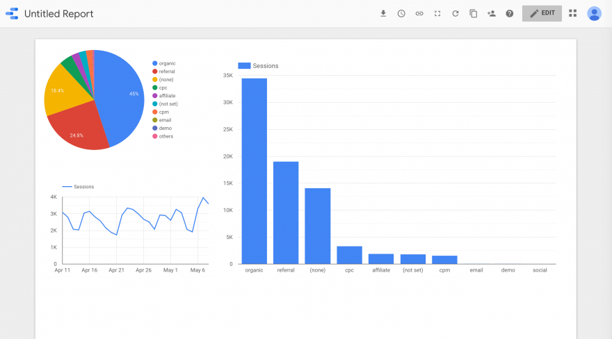
Using data from one or multiple sources, you can generate attractive and readable reports using a familiar Google-designed interface:
Once you’ve created your report, you can easily share it with clients to demonstrate how your efforts have helped their brand. You can add your own branding to the reports as well. All in all, it’s a highly useful tool for both internal data analysis and communicating with clients.
How to use Google Data Studio to take your analytics to the next level?
Step 1: Import your data from all relevant sources:
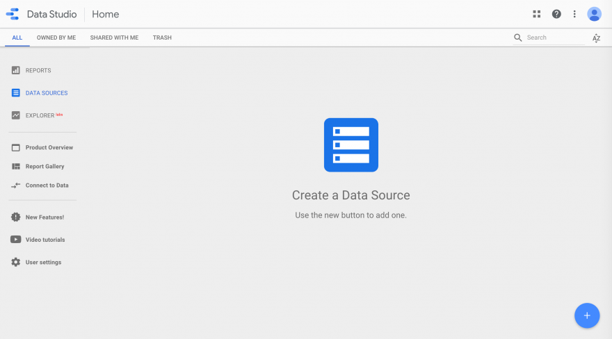
Before you can start creating charts and reports, you’ll need to connect your Google Data Studio account to your data sources. After you’ve logged in, navigate to the Data Sources tab in the sidebar on the left.
Since this is likely your first-time using Data Studio, this area will probably be empty. To add your first data source, click on the blue plus (+) icon in the bottom right-hand corner
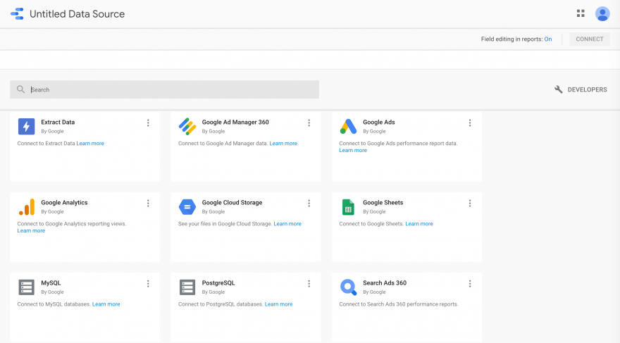
There are 18 native Google Data Studio connectors you can use to add data sources to your account. You’ll also see more than 100 additional connecters created by third parties, some of which require purchase:
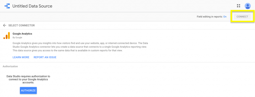
You can easily connect to any sources you wish to use by selecting the corresponding tile. Next, click on the blue Authorize button, then the Connect button in the top right-hand corner:
Repeat the process for each data source you plan to incorporate in your reports. You can name each source to help you easily organize and locate them later.
Step 2: Create reports to visualize and organize data:
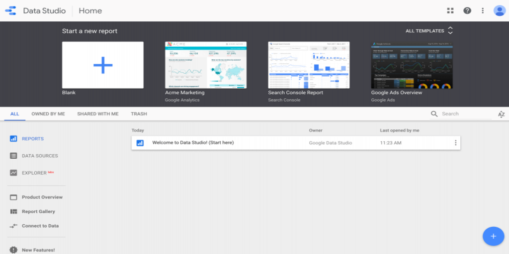
Once all your data sources are connected, you can begin creating charts and custom reports. Click on the Reports tab, then navigate to the Start a new report section at the top of the screen. Here, you can either start from scratch with a blank report, or choose from a variety of templates.
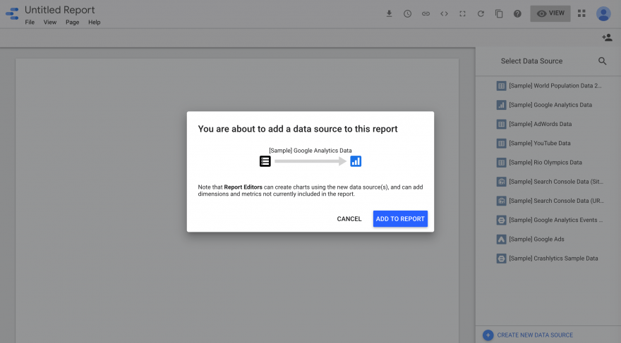
You’ll then be taken the report editor. The first thing you’ll need to do here is select which data source you’ll use to create your report. The sources you connected in the first step will be listed in the right-hand sidebar. Click on the one you need and hit the Add to Report button:
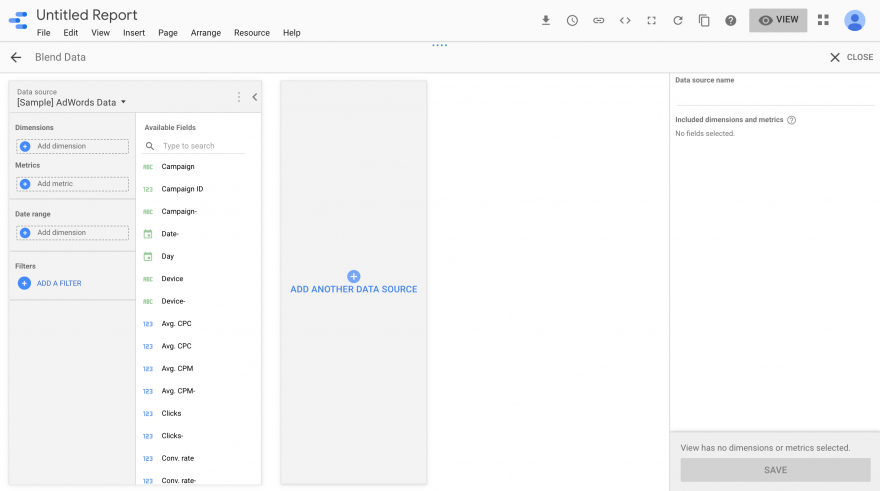
If you want to use multiple data sources, you’ll need to utilize the data blending function by navigating to Resource > Manage blended data in the toolbar.
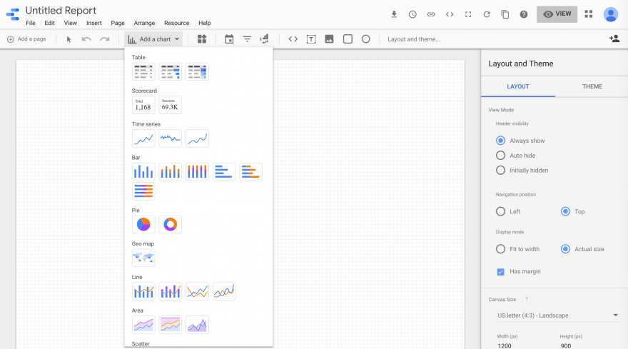
With your sources added to the report, you can now start creating charts. Click on the Add a chart drop-down in the toolbar and select the option that best suits the data you want to visualize.
After you’ve added the chart to your report, you can customize it using the options in sidebar to the right. The editor also includes drag-and-drop functionality, so you can organize your charts in your report however you wish.
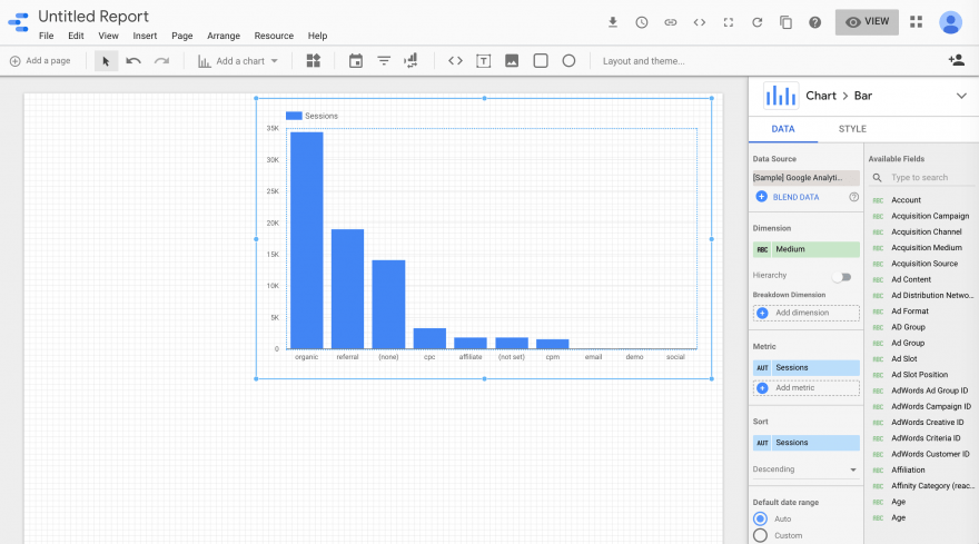
You can further customize your report using the Layout and Theme settings. They’re available in a sidebar that will appear to the right of the editor if you click on Layout and theme in the toolbar.
Another appealing feature of Google Data Studio is that your reports will update automatically as your data sources update. So, once you create a report to display a certain set of information, you won’t have to continually create new ones as the data changes. Simply make sure your data sources stay current.
Step 3: Draw conclusions and share results with clients:
Once the relevant data is displayed in neat charts and graphs, you can start assessing it to find significant patterns and trends. How you draw your conclusions and what you do with them will depend on the data you choose to track and organize in Google Data Studio. A few potential points of interest might include:
- Data from Google Analytics regarding website traffic and user behavior.
- Email marketing campaign metrics.
- Facebook and Instagram ad Click-Through Rates (CTRs).
If you need to share your reports with others, you have multiple options for doing so. At the top of the right-hand side of the screen, you’ll see several icons. The arrow enables you to download a copy of your report. By clicking on the clock icon, you can schedule the report to be sent via email.
The link icon will open Google’s link sharing settings, and the person icon enables you to share the report with specific individuals
The link sharing option is particularly useful, as your clients will be able to monitor changes in the data as your reports update automatically. However, you can limit their access to ‘view-only’ to prevent them from making changes or accidentally deleting charts.
Google Data Studio:
- Import your data from all relevant sources.
- Create reports to visualize and organize data.
- Draw conclusions and share results with clients.